The Impact of Colour in Your Healthcare Practice
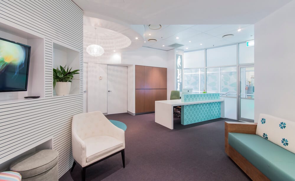
When choosing the colour scheme for your healthcare practice, there’s much more to consider than you may think.
Research has shown that the colours in the environment around them can affect people’s behaviour and moods. By understanding more about colours and their affects, you can make evidence-based decisions about the colour palettes in your practice.

In this blog, we explore how the psychology of colour can be used to inform the design and fitout of your healthcare practice.
Who Are You Affecting?
In any veterinary, dental or medical practice, you’re likely to find two broad categories of people – staff and patients.
- For patients, your choice of colour palette can affect their comfort and mood, including anxiety levels.
- For staff, the colour scheme in your practice can affect their productivity and disposition.
Your choice will affect both your staff and your patients.
The Psychology of Colour
Red
Red is interpreted as an intense colour by many, and can increase people’s heart rates and raise their blood pressure. Because of this, it is generally not recommended being used as a block colour for spaces where you wish to promote calm, such as consult rooms and treatment areas.
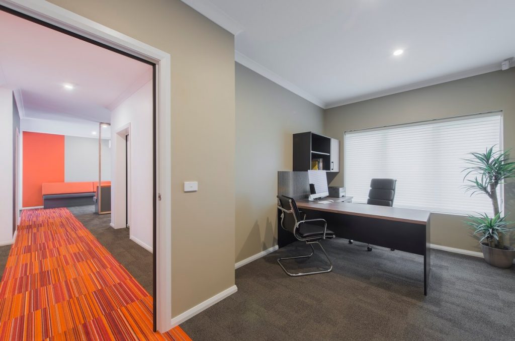
However, because red captures your attention, it’s appropriate for use more sparingly as an accent colour, as a method of wayfinding, or to present information you want people to take notice of.
Greens and Blues
Greens and blues are often recommended for improving productivity and concentration. Lighter shades of green and blue have also been found to have a soothing or calming effect.
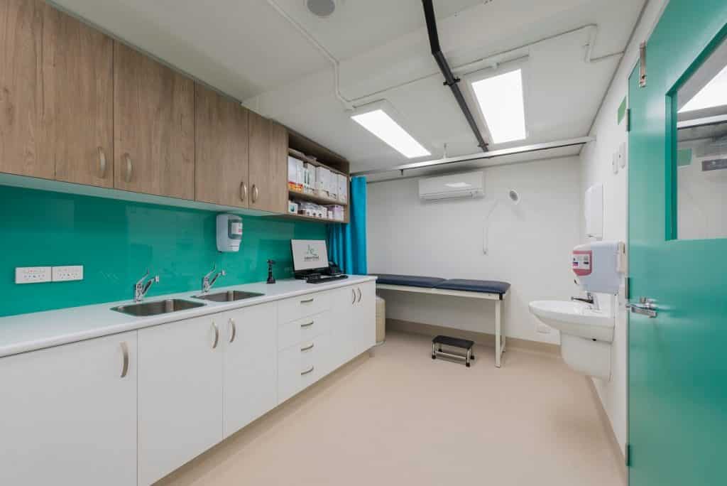
It’s reasonable to suggest that this makes them ideal colours for waiting rooms, consult rooms and treatment areas. After all, productive, “on the ball” staff and calmer, more comfortable patients, is arguably a good combination for any healthcare practice setting.
Pink
Pinks can have a relaxing effect. However, because pink is culturally seen as a feminine colour, this may limit the applications in which it can be used. For a women’s healthcare clinic, it may be a very appropriate colour choice.
White and Neutrals
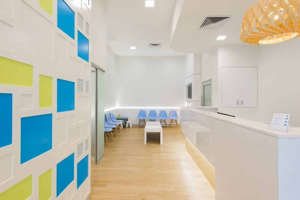
White, cream and beige are associated with cleanliness and light. This is why they are often the predominant or base colour in a practice design and fitout. But this doesn’t mean you have to stick with neutral colours. You can add drama to a white or neutral base with a coloured feature wall, furniture or artwork.
Talk to Elite
At Elite Fitout Solutions, we have many years of experience assisting healthcare practices with colour choices.
Contact us today to discuss your next practice fitout or refurbishment.
- Category :
- Type :