Choosing the Right Colour Palette for Your Practice Fitout

Colour design for your practice fitout goes beyond simply choosing tones that look good together. The right use of colour in your clinic design is key to reassuring your patients and helping them relax.
Here’s what to consider when selecting the colour palette for your practice design.
Colour Wheel Basics
The colour wheel classifies colours according to purity. The primary colours – red, blue and yellow – can’t be made by mixing other colours. Secondary colours like green, orange and purple are made from mixing primary colours.
Primary and secondary colours are often associated with energy and freshness. This makes them ideal for a child-focused practice design, for example.
You can alter any colour using tones, tints and shades to add subtlety. Adding grey affects a colour’s tone, just as adding white changes its tint. To change a colour’s shade, add black.
Feature and Base Colours
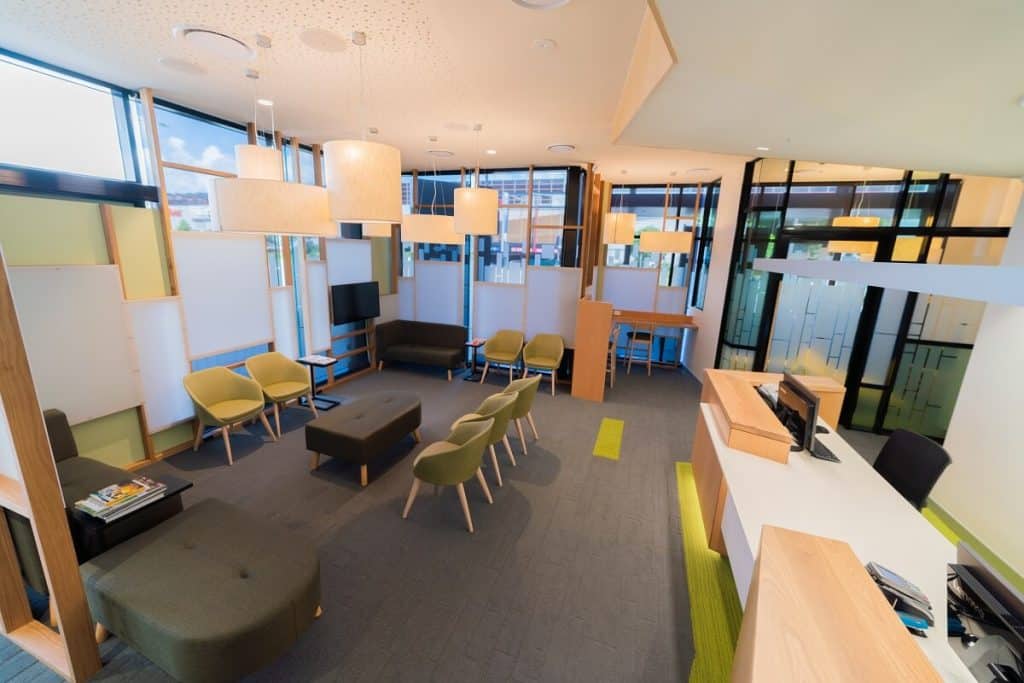
White, cream and beige are associated with cleanliness and light. This is why they often feature in a clinic fitout as the predominant or base colour. You can add drama to this base with a feature wall in a primary colour – a warm orange, or a cool blue, for example.

When using primary and secondary colours, however, care is needed. Studies have shown that bright colours can raise anxiety. Designers will often use a tinted version of grass green, for example, to create a more subdued colour. It still registers against the base colour, but with less dramatic effect.
Reinforcing Your Brand With Colour
Your brand is an important part of your company – to the customer, it is the physical expression of your services and values. Consequently, you want to include your brand colour in the clinic fitout.
This can be a problem if your logo is fire-engine red! But there are other ways to subtly represent your brand as part of an overall colour scheme.
Just as tinting or toning a colour reduces its impact, using less of it also works. Rather than applying red to an entire wall, use it as an accent on the reception desk.
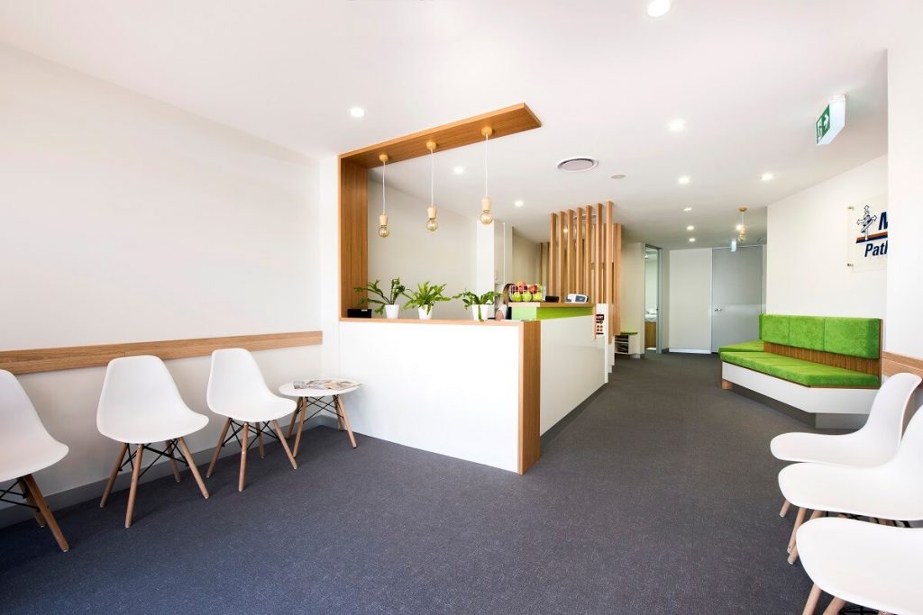
Applying an accent to furniture, such as the backs of waiting room chairs, reinforces your brand, once again connecting it to your practice.
Contact Us
Elite has years of experience designing colour palettes to suit medical, dental or veterinary clinics. Take a look at our recent fitouts for colour inspiration, and contact us to discuss your practice design and fitout.
- Category :
- Type :