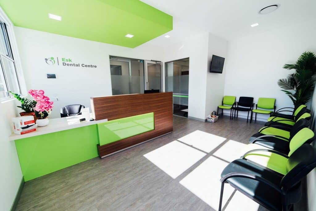
Your dental clinic may need to be sterile, but it doesn’t have to look sterile. In fact, the less “clinical” your practice looks (especially in your waiting room), the better. After all, it’s well established that many people experience a level of anxiety when they need to visit the dentist.

In this blog we’ve included a few dental clinic design ideas that can help you create a comfortable and inviting space for your patients.
Natural Light
The presence of natural light is generally agreed to have mental and physical health benefits. Glass doors, expansive windows, skylights and mirrors that reflect the light can all be incorporated into your dental clinic design to maximise natural light. In turn, this will maximise your patients’ physical comfort. And as an added bonus, it can reduce your electricity bill, too.

However, if natural light is difficult to achieve in your clinic, clever design can have the same effect. Skylights, light boxes and clever lighting – as seen in the Melbourne Oral & Maxillofacial Surgery fitout – can still deliver a bright and welcoming space.

“Borrowing” light from another room, light coloured walls and strategically located mirrors are also great ways to help to simulate the effective of natural light.
Natural Elements
Looking at or being around natural elements can help to calm your more anxious patients. Adding some living elements to your waiting room – in the form of real plants, fresh flowers or realistic-looking greenery – will help increase the aesthetic appeal to your practice.

You could also consider incorporating “natural” images throughout your practice such as landscape paintings or photos. Displaying canvases or murals of natural images can help to enliven otherwise blank spaces such as the walls in waiting rooms or hallways.
Colour
While white and other neutral colours are popular choices for dental clinic design, adding a pop of colour can have a great impact. This can be in the form of furniture and other furnishings, a feature wall or other wall furnishings.

A great way to subtly represent your brand is by using it as part of the overall colour scheme. But this doesn’t mean you have to use these colours on every surface. It’s best to apply your brand colour as an accent colour. This could be on the reception desk, to the backs of waiting room chairs, or on a feature wall.
Contact Us
At Elite Fitout Solutions, we’re passionate about helping to design and fitout practices that offer an inviting patient experience.
For more dental clinic design ideas, view examples of our recent dental fitouts here. Or contact us on 1300 765 344.
- Category :
- Type :
